Summary
Jakob Nielsen’s 10 general principles for interaction design. They are called “heuristics” because they are broad rules of thumb and not specific usability guidelines.
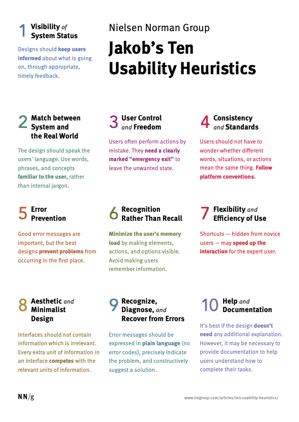
1: Visibility of system status
系统状态的可见性
The design should always keep users informed about what is going on, through appropriate feedback within a reasonable amount of time. 设计应始终通过在合理的时间内提供适当的反馈,让用户了解正在发生的事情。
When users know the current system status, they learn the outcome of their prior interactions and determine next steps. Predictable interactions create trust in the product as well as the brand. 当用户知道当前的系统状态时,他们会了解之前交互的结果并确定后续步骤。 可预测的互动可以建立对产品和品牌的信任。
Usability Heuristic #1: Man beside “You Are Here” indicators on a mall maps to show him where he currently is.
Example of Usability Heuristic #1:
You Are Here indicators on mall maps show people where they currently are, to help them understand where to go next. 商场地图上的“你在这里”指示器向人们显示他们当前所在的位置,以帮助他们了解下一步该去哪里。
Tips
Communicate clearly to users what the system’s state is — no action with consequences to users should be taken without informing them. 向用户清楚地传达系统的状态——在未通知用户的情况下,不应采取任何会对用户造成后果的操作。
Present feedback to the user as quickly as possible (ideally, immediately). 尽快(最好是立即)向用户提供反馈。
Build trust through open and continuous communication. 通过开放和持续的沟通建立信任。
推荐阅读
2: Match between system and the real world
系统与现实世界的匹配
The design should speak the users’ language. Use words, phrases, and concepts familiar to the user, rather than internal jargon. Follow real-world conventions, making information appear in a natural and logical order. 设计应该讲用户的语言。使用用户熟悉的单词、短语和概念,而不是内部术语。遵循现实世界的惯例,使信息以自然且符合逻辑的顺序出现。
The way you should design depends very much on your specific users. Terms, concepts, icons, and images that seem perfectly clear to you and your colleagues may be unfamiliar or confusing to your users. 您和您的同事看似非常清楚的术语、概念、图标和图像可能对您的用户来说不熟悉或令人困惑。
When a design’s controls follow real-world conventions and correspond to desired outcomes (called natural mapping), it’s easier for users to learn and remember how the interface works. This helps to build an experience that feels intuitive.
Example of Usability Heuristic #2:
When stovetop controls match the layout of heating elements, users can quickly understand which control maps to which heating element.
Tips
Ensure that users can understand meaning without having to go look up a word’s definition. 确保用户无需查找单词的定义即可理解含义。
Never assume your understanding of words or concepts will match that of your users. 永远不要假设您对单词或概念的理解与您的用户的理解一致。
User research will uncover your users’ familiar terminology, as well as their mental models around important concepts. 用户研究将揭示用户熟悉的术语,以及他们围绕重要概念的心理模型。
Learn more
3: User control and freedom
用户控制和自由
Users often perform actions by mistake. They need a clearly marked “emergency exit” to leave the unwanted action without having to go through an extended process. 用户经常会错误地执行操作。 他们需要一个明确标记的“紧急出口”来离开不需要的行动,而不必经历一个漫长的过程。
When it’s easy for people to back out of a process or undo an action, it fosters a sense of freedom and confidence. Exits allow users to remain in control of the system and avoid getting stuck and feeling frustrated. 当人们很容易退出某个过程或撤消某个操作时,就会培养一种自由感和自信。退出允许用户保持对系统的控制,避免陷入困境和感到沮丧
Example of Usability Heuristic #3:
Digital spaces need quick emergency exits, just like physical spaces do. 数字空间需要快速的紧急出口,就像物理空间一样。
Tips
- Support Undo and Redo.
- Show a clear way to exit the current interaction, like a Cancel button.
- Make sure the exit is clearly labeled and discoverable.
Learn more
4: Consistency and standards
一致性和标准
Users should not have to wonder whether different words, situations, or actions mean the same thing. Follow platform and industry conventions. 用户不必怀疑不同的词语、情况或动作是否意味着同一件事。 遵循平台和行业惯例。
Jakob’s Law states that people spend most of their time using digital products other than yours. Users’ experiences with those other products set their expectations. Failing to maintain consistency may increase the users’ cognitive load by forcing them to learn something new. 雅各布定律指出,人们大部分时间都花在使用除您的产品之外的数字产品上。用户对其他产品的体验决定了他们的期望。未能保持一致性可能会迫使用户学习新东西,从而增加用户的认知负担。
Example of Usability Heuristic #4:
Checkin counters are usually located at the front of hotels. This consistency meets customers’ expectations.
登记柜台通常位于酒店前面。这种一致性满足了客户的期望。
Tips
- Improve learnability by maintaining both types of consistency: internal and external. 通过保持内部和外部两种一致性来提高可学习性。
- Maintain consistency within a single product or a family of products (internal consistency). 保持单个产品或产品系列内的一致性(内部一致性)。
- Follow established industry conventions (external consistency). 遵循既定的行业惯例(外部一致性)。
Learn more
5: Error prevention
错误预防
Good error messages are important, but the best designs carefully prevent problems from occurring in the first place. Either eliminate error-prone conditions, or check for them and present users with a confirmation option before they commit to the action. 良好的错误消息很重要,但最好的设计首先会仔细防止问题的发生。要么消除容易出错的情况,要么检查它们并在用户承诺操作之前向用户提供确认选项。
There are two types of errors: slips and mistakes. Slips are unconscious errors caused by inattention. Mistakes are conscious errors based on a mismatch between the user’s mental model and the design. 错误有两种类型:失误和失误。
- 失误是由于注意力不集中而导致的无意识错误。
- 错误是基于用户心理模型与设计之间不匹配的有意识的错误。
Example of Usability Heuristic #5:
Guard rails on curvy mountain roads prevent drivers from falling off cliffs. 弯曲山路上的护栏可以防止司机从悬崖上摔下来。
Tips
- Prioritize your effort: Prevent high-cost errors first, then little frustrations. 优先考虑你的努力:首先防止高成本的错误,然后再防止小挫折。
- Avoid slips by providing helpful constraints and good defaults. 通过提供有用的约束和良好的默认值来避免失误。
- Prevent mistakes by removing memory burdens, supporting undo, and warning your users. 通过消除记忆负担、支持撤消和警告用户来防止错误。
Learn more
6: Recognition rather than recall
识别而不是回忆
Minimize the user’s memory load by making elements, actions, and options visible. The user should not have to remember information from one part of the interface to another. Information required to use the design (e.g. field labels or menu items) should be visible or easily retrievable when needed. 通过使元素、操作和选项可见来最小化用户的记忆负载。 用户不必记住从界面的一个部分到另一部分的信息。 使用设计所需的信息(例如字段标签或菜单项)应该是可见的或在需要时易于检索。
Humans have limited short-term memories. Interfaces that promote recognition reduce the amount of cognitive effort required from users. 人类的短期记忆是有限的。促进识别的界面减少了用户所需的认知工作量。
Example of Usability Heuristic #6:
It’s easier for most people to recognize the capitals of countries, instead of having to remember them. People are more likely to correctly answer the question Is Lisbon the capital of Portugal? rather than What’s the capital of Portugal? 对于大多数人来说,识别国家的首都更容易,而不必记住它们。人们更有可能正确回答这个问题:里斯本是葡萄牙的首都吗?而不是葡萄牙的首都是什么?
Tips
- Let people recognize information in the interface, rather than forcing them to remember (“recall”) it. 让人们识别界面中的信息,而不是强迫他们记住(“回忆”)它。
- Offer help in context, instead of giving users a long tutorial to memorize. 在上下文中提供帮助,而不是给用户提供冗长的教程来记忆。
- Reduce the information that users have to remember. 减少用户必须记住的信息。
Learn more
7: Flexibility and efficiency of use
使用的灵活性和效率
Shortcuts — hidden from novice users — may speed up the interaction for the expert user so that the design can cater to both inexperienced and experienced users. Allow users to tailor frequent actions. 对新手用户隐藏的快捷方式可以加快专家用户的交互速度,以便设计可以同时满足缺乏经验和有经验的用户的需求。允许用户定制频繁的操作。
Flexible processes can be carried out in different ways, so that people can pick whichever method works for them. 灵活的流程可以通过不同的方式进行,以便人们可以选择适合自己的方法。
Example of Usability Heuristic #7:
Regular routes are listed on maps, but locals with knowledge of the area can take shortcuts. 地图上列出了常规路线,但熟悉该地区的当地人可以走捷径。
Tips
- Provide accelerators like keyboard shortcuts and touch gestures. 提供键盘快捷键和触摸手势等加速器。
- Provide personalization by tailoring content and functionality for individual users. 通过为个人用户定制内容和功能来提供个性化
- Allow for customization, so users can make selections about how they want the product to work. 允许定制,以便用户可以选择他们希望产品如何工作。
Learn more
-Full article: Flexibility and Efficiency of Use: The 7th Usability Heuristic Explained
8: Aesthetic and minimalist design
美观和简约的设计
Interfaces should not contain information that is irrelevant or rarely needed. Every extra unit of information in an interface competes with the relevant units of information and diminishes their relative visibility. 界面不应包含不相关或很少需要的信息。界面中每一个额外的信息单元都会与相关的信息单元竞争,并降低它们的相对可见性。
This heuristic doesn’t mean you have to use a flat design — it’s about making sure you’re keeping the content and visual design focused on the essentials. Ensure that the visual elements of the interface support the user’s primary goals. 这种启发式并不意味着您必须使用扁平化设计 - 它是为了确保您将内容和视觉设计集中在要点上。确保界面的视觉元素支持用户的主要目标。
Example of Usability Heuristic #8:
An ornate teapot may have excessive decorative elements, like an uncomfortable handle or hard-to-wash nozzle, that can interfere with usability. 华丽的茶壶可能有过多的装饰元素,例如不舒服的手柄或难以清洗的喷嘴,这可能会影响可用性。
Tips
- Keep the content and visual design of UI focused on the essentials. 让 UI 的内容和视觉设计集中在要点上。
- Don’t let unnecessary elements distract users from the information they really need. 不要让不必要的元素分散用户对他们真正需要的信息的注意力。
- Prioritize the content and features to support primary goals. 先考虑支持主要目标的内容和功能。
Learn more
9: Help users recognize, diagnose, and recover from errors
帮助用户识别、诊断错误并从错误中恢复
Error messages should be expressed in plain language (no error codes), precisely indicate the problem, and constructively suggest a solution. 错误消息应该用简单的语言(没有错误代码)表达,准确地指出问题,并建设性地提出解决方案。
These error messages should also be presented with visual treatments that will help users notice and recognize them. 这些错误消息还应该通过视觉处理来呈现,以帮助用户注意到和识别它们。
Example of Usability Heuristic #9:
Wrong way signs on the road remind drivers that they are heading in the wrong direction and ask them to stop. 道路上的逆向标志提醒司机他们走错方向并要求他们停车。
Tips
- Use traditional error-message visuals, like bold, red text. 使用传统的错误消息视觉效果,例如粗体、红色文本。
- Tell users what went wrong in language they will understand — avoid technical jargon. 用他们能理解的语言告诉用户出了什么问题——避免使用技术术语。
- Offer users a solution, like a shortcut that can solve the error immediately. 为用户提供一个解决方案,就像一个可以立即解决错误的捷径。
Learn more
10: Help and documentation
帮助和文档
It’s best if the system doesn’t need any additional explanation. However, it may be necessary to provide documentation to help users understand how to complete their tasks. 最好系统不需要任何额外的解释。但是,可能有必要提供文档来帮助用户了解如何完成其任务。
Help and documentation content should be easy to search and focused on the user’s task. Keep it concise, and list concrete steps that need to be carried out. 最好系统不需要任何额外的解释。但是,可能有必要提供文档来帮助用户了解如何完成其任务。
Example of Usability Heuristic #10:
Information kiosks at airports are easily recognizable and solve customers’ problems in context and immediately. 机场的信息亭易于识别,可以立即解决客户的问题。
Tips
- Ensure that the help documentation is easy to search. 确保帮助文档易于搜索。
- Whenever possible, present the documentation in context right at the moment that the user requires it. 只要有可能,就在用户需要时在上下文中呈现文档。
- List concrete steps to be carried out. 列出要执行的具体步骤。
Learn more
「真诚赞赏,手留余香」
 Hi@Yoese
真诚赞赏,手留余香
使用微信扫描二维码完成支付